TracCloud: Custom Fields
From Redrock Wiki
(Redirected from TracCloud: Custom Fields)
Global Preferences
Custom fields can be configured throughout TracCloud to store additional data that your campus may require. These custom fields can be displayed in student profiles, appointments, visits, faculty, registrations, and more.
These fields can be viewed just like other standard fields, and can even be used in reports. This data can also be imported from your Student Information System just like the rest of the standard fields, more information on that can be found in our import article.
Custom Fields can be managed in Other ➜ Other Options ➜ Custom Fields.

Creating a new Custom Field
To begin creating your new custom field, go to Other ➜ Other Options ➜ Custom Fields ➜ Add new field. This will open the custom field entry screen where you can begin to customize your new field.

- Profile
- Determines which profile this custom field is active for, including “All Profiles” if preferred.
- Determines which profile this custom field is active for, including “All Profiles” if preferred.
- Location
- This determines where the field displays. There are several locations available:
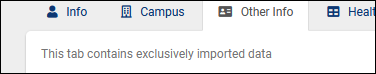
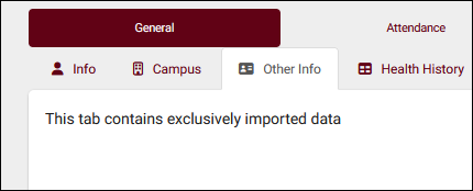
- Student – Campus / Other Info / Custom1-5 displays within one of these tabs on student profiles. The name of the “Custom” tabs can be changed in your Student Entry Choices preferences. The purpose of separating these fields onto separate tabs is both for better organization of custom fields and for permissions management, as access to each of these tabs can be managed in permission groups.
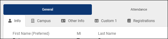
- Student – Campus / Other Info / Custom1-5 displays within one of these tabs on student profiles. The name of the “Custom” tabs can be changed in your Student Entry Choices preferences. The purpose of separating these fields onto separate tabs is both for better organization of custom fields and for permissions management, as access to each of these tabs can be managed in permission groups.

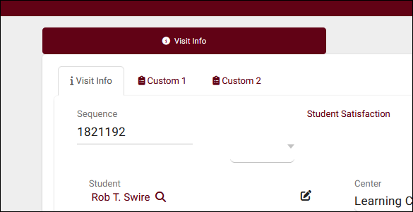
- Visit – Student / Consultant displays in the visit record. Typically used with “Asked on log in/out” enabled, that way the student or staff member can input this information from the Log Listing/Kiosk view.
- Visit - Custom 1 - 4 displays in separate tabs in the visit record, in a similar format to the student tabs described above. This allows you to have multiple sets of custom fields conveniently grouped together in separate spaces, rather than maintaining a long list of fields on a single tab. These tabs can be renamed in your profile's advanced preferences.

- Visit - Q2 Raise Hand displays on the Raise Hand prompt for Q2, applying to Q2Remote and when raising a hand from the Log Listing.
- Appointment – Student / Consultant will appear during the appointment booking process, with separate tabs containing different questions for students or consultants. This location is also unique in that it's the only custom field location that can be center-specific. After selecting this location and a specific profile, additional options will become available to only show this field for a certain center or exclude it from a certain center.
- Appointment Invite will appear inside the appointment invite form.
- Availability appears in availability blocks under the 'Notes' tab.
- Center appears in center records under the 'General' tab.
- Consultant appears in consultant profiles under the “Contact & Other Data” tab.
- Faculty appears within faculty profiles.
- Outstanding Requests appears in the outstanding appointment requests submission form to students and in the request itself.
- Registration appears in registration records. Frequently used for additional enrollment data or midterm grades.
- Reason appears within each of your Reasons. Possibly a description of the purpose of the reason, or any additional information that staff may need to reference when making changes later.
- Resource appears in each of your Resources. Typically used for resource location.
- Section appears in each section record.
- Certification appears in consultant certifications.
- Document appears in the document entry screen and during document upload.
- Document appears in the document entry screen and during document upload.
- Inactive
- Marks the field as inactive. This is recommended if you aren’t planning on utilizing a field anymore, but don’t want to remove the data associated with it. This way the data is still available if you want to re-enable it again in the future, but it won’t be visible throughout general TracCloud use.
- Marks the field as inactive. This is recommended if you aren’t planning on utilizing a field anymore, but don’t want to remove the data associated with it. This way the data is still available if you want to re-enable it again in the future, but it won’t be visible throughout general TracCloud use.
- Field Name
- This is the internal name of this field, shown in the custom fields menu and in report field lists. This needs to be a shorter, unique name without spaces, something like “Student_Notes” instead of “Do you have any notes on your visit today?”.
- This is the internal name of this field, shown in the custom fields menu and in report field lists. This needs to be a shorter, unique name without spaces, something like “Student_Notes” instead of “Do you have any notes on your visit today?”.
- Prompt Text
- This is the text that’s shown to your users when viewed. Continuing from the example above, this one should be “Do you have any notes on your visit today?”. This is visible in the record itself.
- This is the text that’s shown to your users when viewed. Continuing from the example above, this one should be “Do you have any notes on your visit today?”. This is visible in the record itself.
- Field Entry Type
- The type of field. Text boxes, multiple choice questions, etc. A list of options with example screenshots can be found further into this article.
- The type of field. Text boxes, multiple choice questions, etc. A list of options with example screenshots can be found further into this article.
- Show on KIOSK Login/Logout
- These determine if the field is displayed during the login/logout process on the log listing/kiosk. This even applies to non-visit fields. The student could be asked a question relating to one of their student or registration fields, for example.
- These determine if the field is displayed during the login/logout process on the log listing/kiosk. This even applies to non-visit fields. The student could be asked a question relating to one of their student or registration fields, for example.
- Required
- Sets the field to required, so an answer must be provided before continuing/saving.
- Sets the field to required, so an answer must be provided before continuing/saving.
- Archive
- If checked, the contents of this field will be included in the student term data archive so you can report on what the value of the field was during a prior semester rather than only its current value.
- If checked, the contents of this field will be included in the student term data archive so you can report on what the value of the field was during a prior semester rather than only its current value.
- Show on Timeline
- Displays this field on the student timeline alongside Visit Notes.
- Displays this field on the student timeline alongside Visit Notes.
- Hide from Consultants
- Hides this Custom Field from consultant view (e.g., for Student Visit Remarks).
- Hides this Custom Field from consultant view (e.g., for Student Visit Remarks).
- Hide on SI Batch Visit Entry
- Hides this field on batch visit entry.
- Hides this field on batch visit entry.
- Field, Menu, or Radio Choices and # Lines
- Depending on which Field Entry Type is used, this option will change. “Field, Menu, or Radio Choices” allows you to list out your various options for multiple-choice questions. “# Lines” determines the size of text boxes for essay fields.
- Depending on which Field Entry Type is used, this option will change. “Field, Menu, or Radio Choices” allows you to list out your various options for multiple-choice questions. “# Lines” determines the size of text boxes for essay fields.
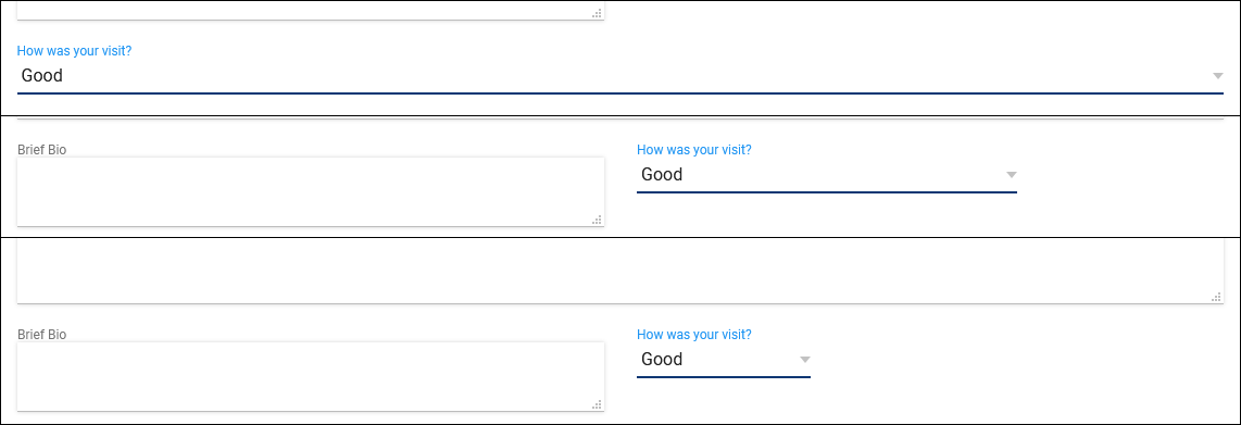
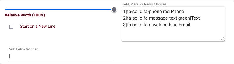
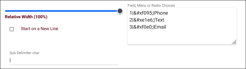
- Relative Width
- This determines the size of the field. 100% will span the entire Info box, while 8% will only have enough space for a single letter to be visible. The example screenshot below displays our custom field at 100%, 33%, and 17%.

- Start on a New Line
- Custom Fields are formatted automatically. For example, if you have a 50% width field followed by another 50% width field, they will appear on the same line at the same height in the page. If this box is checked, it forces this custom field to start on a new line regardless of the width of the previous field.
- Custom Fields are formatted automatically. For example, if you have a 50% width field followed by another 50% width field, they will appear on the same line at the same height in the page. If this box is checked, it forces this custom field to start on a new line regardless of the width of the previous field.
- Maximum # of choices allowed ("Multiple Checkboxes" fields only)
- This field allows you to set the maximum number of selections a user can make from the set of choices. If left blank, the user can check up to every box.
- This field allows you to set the maximum number of selections a user can make from the set of choices. If left blank, the user can check up to every box.
- Longer prompt (Optional) ("Image Pop Field" fields only)
- Any text entered in this field will display between the prompt text and the answer field.
- Any text entered in this field will display between the prompt text and the answer field.
- Menu Width ("Image Pop Field" fields only)
- The horizontal size of the icon menu. If left blank, the default is 210.
- The horizontal size of the icon menu. If left blank, the default is 210.
- Item Width ("Image Pop Field" fields only)
- The distance between icons. Setting this below 35 is not recommended. If left blank, the default is 50.
- The distance between icons. Setting this below 35 is not recommended. If left blank, the default is 50.
- Delete
- Deletes the custom field. We would recommend deactivating the field instead, but if there’s no data tied to it yet or the data needs to be deleted, then this option is available.
- Deletes the custom field. We would recommend deactivating the field instead, but if there’s no data tied to it yet or the data needs to be deleted, then this option is available.
- Single line entry field allows us to either type in a custom response or select an option from the drop-down menu.

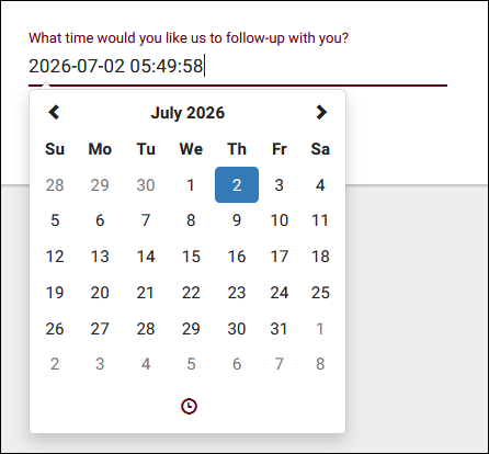
- Date/Time field provides a date and time chooser, which will store the answer as YYYY-MM-DD HH:MM:SS.

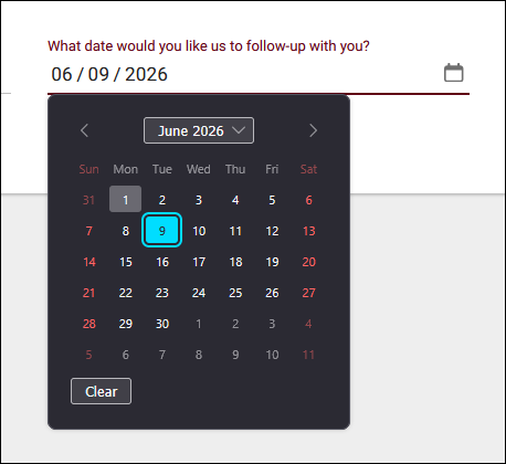
- Date field similar to above, but without the time.

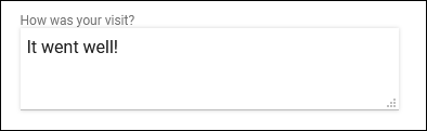
- Text Entry Area provides a text box that we can write anything we’d like in. If this option is selected, we can specify how many lines tall this box is by default.

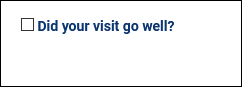
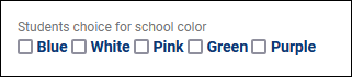
- Checkbox simply provides a checkbox next to your field name.

- Multiple Checkboxes provides multiple choices, allowing more than one to be selected at once.

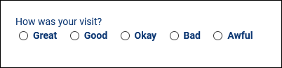
- Radio Option provides multiple choices, but only allows a single option to be selected.

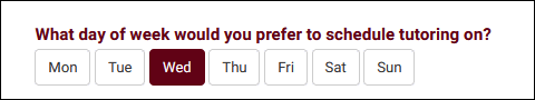
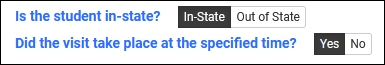
- Push Button Radio functions similarly to "Radio Option," but provides the choices as buttons rather than checkboxes.

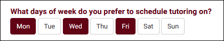
- Multi Push Button Radio functions similarly to "Multiple Checkboxes," but provides the choices as buttons rather than checkboxes.

- Radio Icon Options provides icons that can be selected instead of a checkbox. This requires a specific format in your custom field choices. Sub Delimiter Char should almost always be set to "|" (pipe/vertical bar). The choices must be formatted as:
- <choice value, typically counting up from 1>|<the Font Awesome icon you want to use>|<title/name of choice>.


- Toggle Option displays as a toggleable choice. By default, Yes/No will be used, but custom options can also be specified in the “Field, Menu or Radio Choices” box.

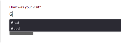
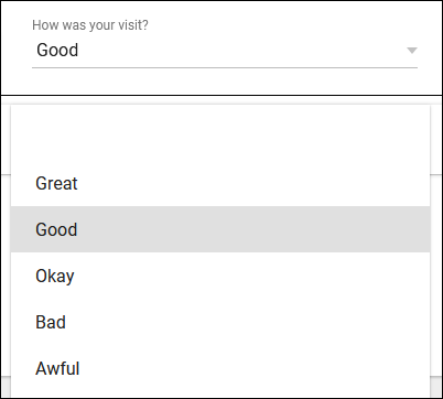
- Menu Field provides a drop-down list of options when selected.

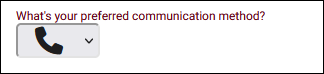
- Image Menu Field provides a vertically formatted drop-down list of icons rather than text options. This requires a specific format in your custom field choices. Sub Delimiter Char should almost always be set to "|" (pipe/vertical bar). The choices must be formatted as:
- <choice value, typically counting up from 1>|<the unicode value of the Font Awesome icon you want to use>|<title/name of choice>.


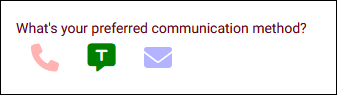
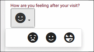
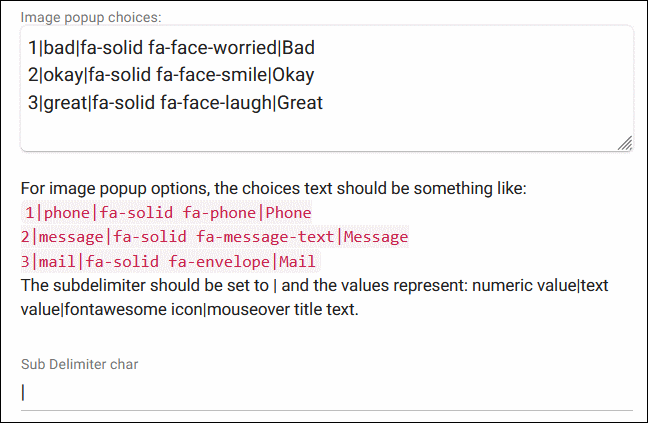
- Image Pop Field provides a horizontally formatted list of icons rather than text options. If many options are available, icons will wrap to the next line. This requires a specific format in your custom field choices. Sub Delimiter Char should almost always be set to "|" (pipe/vertical bar). The choices must be formatted as:
- <choice value, typically counting up from 1>|<the text value of the field>|<the Font Awesome icon you want to use>|<title/name of choice, which appears on hover>.


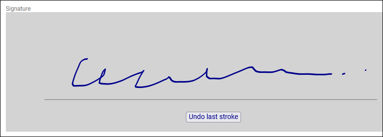
- Signature provides a box that users can scrawl their signature in.

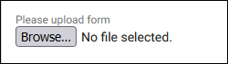
- Document allows users to upload a document to the field. If this entry type is chosen, you can optionally list allowed file types in the Field, Menu or Radio Choices box (e.g., ".txt,.docx"). This custom field type is not compatible with the Appointment, Document, or Visit - Q2 Raise Hand locations.

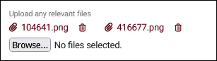
- Multi-Document is similar to the above, but allows uploading multiple documents to one field.

- Label (non-entry) allows you to add text without being tied to an entry field.

- Info (non-entry) is a non-entry field like label, but text is in a slightly larger font and text wrapping is supported.

- Header (non-entry) is similar to Info, but displays in a larger underlined font. If multiple headers are present in student accounts, hyperlinks will be available along the top of the tab to jump to that section of the page.

A custom field "Group" allows you to group other custom fields together in a colored box in any of the normal custom field locations. Creating a custom field group starts like any other custom field in TracCloud (detailed above), except the "Field Entry Type" is set to "Field Group."

- Group Color
- Choose the background color for the fields placed into this group.
- Choose the background color for the fields placed into this group.
- Repeating group values
- Enabling this option will allow for multiple values to be recorded for each field in the group, with the entire group having pages to create, delete, or review. When reporting on fields in this group, the most recent value will be shown. Fields in a group with this option enabled cannot be imported and must be filled out manually.
- Enabling this option will allow for multiple values to be recorded for each field in the group, with the entire group having pages to create, delete, or review. When reporting on fields in this group, the most recent value will be shown. Fields in a group with this option enabled cannot be imported and must be filled out manually.
- Group Border
- Adds an outline to the group box.
- Adds an outline to the group box.
After creating the group, return to the custom field listing and select the location containing your group and the other custom fields (Student - Custom1 in the screenshot below).

There are two ways to add custom fields to a group. First is by simply clicking and dragging the custom field into the group. Drag the icon of the custom field over the group in the list.

Alternatively, you can change the location of the custom field to the group, as the group becomes a location in the drop-down menu.

After moving the custom fields into the group, you can click the button of the group to view them. Additionally, you can drag custom fields to the to move them back out of the group (or change the location field within the field settings).

Here is what the example above looks like in a student account.

The custom fields listing also offers a few utilities for managing your fields. You can search for specific fields, filter the list by assigned profile or location, or even change custom field options directly from the list with the icons shown. When a specific location is chosen, you will also be able to click and drag custom fields using the icon to reorder them in the list. This reorders them in the location they appear in.
- Inactive
- Show on KIOSK Login
- Show on KIOSK Logout
- Required
- Show on Timeline
- Hide from Consultants
- Hide on SI Batch Visit Entry
The listing hamburger menu also has a couple options relevant to custom fields.
- List All
- This option will show all records on the current listing. Some listings have an additional toggle for only showing active records, such as the student and registration listing, which will override a List All search if checked.
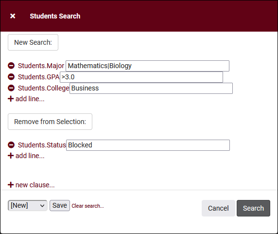
- Power Search
- This option provides a simple but powerful search utility to find the records you need. String together multiple searches, adding or removing results for each. Use Search Symbols to include ranges of data, and Save Searches for later use if needed. The search term 'blankornull' can be used to find all records with a value of nothing ("") or null ().

- Selected...
- The Selection Tool offers several options to filter and manage your records. More information on this feature can be found in its own dedicated article here.
For Visit and Custom Form custom fields specifically, you can create an alias field that displays (and optionally allows updating) a corresponding custom field in a student record.
Take the pair of custom fields below for example. "Last_Visit_Status" is a regular custom field in the student record. "ALIAS:Last_Visit_Status" is a visit custom field that inherits the value from the student's account when you open a visit record. If you make a change to that value in the visit, it updates the student record and the visit record keeps what you entered. On future visits, any edits to this field will update the student record in the same way, but each visit will keep what was entered at the time.
If you instead want to transclude a read-only version of the custom field to the visit or custom form, you can create a custom field named "DISPLAYALIAS:ExampleFieldName". This will still show the current student record value in the visit or form, but it will not be editable from the visit/form.

See Also