|
|
Custom Fields
Custom fields can be configured throughout TracCloud to store additional data that your campus may require. These custom fields can be displayed in student profiles, appointments, visits, faculty, registrations, and more.
These fields can be viewed just like other fields, and even used in reports. This data can also be imported from your Student Information System just like the rest of the standard fields, more information on that can be found in our Import articles.
File:8420812.png
Creating a new Custom FieldAs a basic example, let’s create a custom field for our students. Maybe we want an extra field to specify a student’s assigned advisor. To begin, open up the Custom Fields section in your System Preferences, scroll to the bottom, and select the + icon. This will add a new item to our list, where we can begin configuring the field.
File:7023274.png
- By clicking-and-dragging this icon, we can move this field throughout our list. This also determines the order the fields appear in within their respective locations.
- This is the field name. The field name cannot contain spaces (see Prompt Text later)
- Opens a menu with additional options, which will be covered later in this article.
- These determine if the field is displayed during the login/logout process on the log listing/kiosk. This even applies to non-visit fields. The student could be asked a question relating to one of their student or registration fields, for example.
- Sets the field to required, so an answer must be provided before continuing/saving.
- Marks the field as inactive. This is recommended if you aren’t planning on utilizing a field anymore, but don’t want to remove the data associated with it. This way the data is still available if you want to re-enable it again in the future, but it won’t be visible throughout general TracCloud use.
- Displays this field on the student timeline alongside Visit Notes.
- Hides this Custom Field from consultant view (e.g., for Student Visit Remarks).
- This determines where the field displays. There are several locations available:
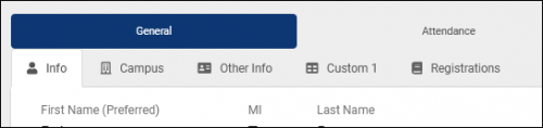
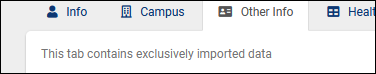
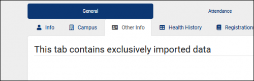
- Student – Campus / Other Info / Custom1 displays within one of three tabs on student profiles. The name of the “Custom 1” tab can be changed in your Student Entry Choices menu, as described in the previous article.
- Visit – Student / Consultant displays in the visit record. Typically used with “Asked on log in/out” enabled, that way the student or staff member can input this information from the Log Listing/Kiosk view.
- Visit - Q2 Raise Hand displays on the Raise Hand prompt for Q2, applying to Q2Remote and when raising a hand from the Log Listing.
- Appointment – Student / Consultant will appear during the appointment booking process, with a unique tab containing different questions for students or consultants.
- Consultant displays in consultant profiles under the “Contact & Other Data” tab.
- Faculty displays within faculty profiles.
- Registration appears within registration records. Frequently used for additional enrollment data or midterm grades.
- Reason appears within each of your Reasons. Possibly a description of the purpose of the reason, or any additional information that staff may need to reference when making changes later.
- Section appears in each section record.
- Certification appears within consultant certifications.
- Determines which profile this custom field is active for, including “All Profiles” if preferred.
- Deletes the custom field. We would recommend deactivating the field instead, but if there’s no data tied to it yet or the data needs to be deleted, then this option is available.
More Options (Pencil icon)
After selecting the pencil icon, we’re shown an alternate way to look at the same options as before, as well as a few additional settings.
File:2937486.png
- This is the internal name of this field. This needs to be a shorter, unique name without spaces, something like “Student_Notes” instead of “Do you have any notes on your visit today?”
- This is the text that’s shown to your users when viewed. Continuing from the example above, this one should be “Do you have any notes on your visit today?”
- This determines the type of response available.
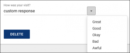
- Single line entry field allows us to either type in a custom response or select an option from the drop-down menu.
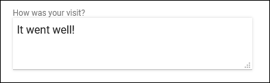
- Text Entry Area provides a text box that we can write anything we’d like in. If this option is selected, we can specify how many lines tall this box is by default.
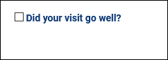
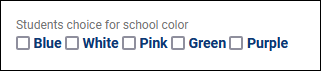
- Checkbox simply provides a checkbox next to your field name.
- Multiple Checkboxes provides multiple choices, allowing more than one to be selected at once.
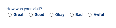
- Radio Option provides multiple choices, but only allows a single option to be selected.
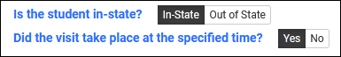
- Toggle Option displays as a toggleable choice. By default, Yes/No will be used, but custom options can also be specified in the “Field, Menu or Radio Choices” box.
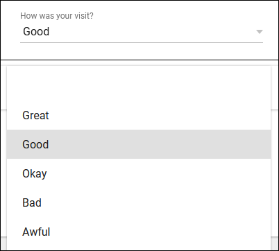
- Menu Field provides a drop-down list of options when selected.
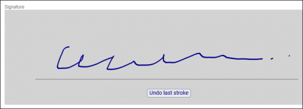
- Signature provides a box that users can scrawl their signature in.
- Label (non-entry) allows you to add text without being tied to an entry field.
- Header (non-entry) is similar to Label, but displays in a larger underlined font.
- Field, Menu, or Radio Choices and # Lines
- Depending on which Field Entry Type is used, this option will change. “Field, Menu, or Radio Choices” allows you to list out your various options for multiple-choice questions. “# Lines” determines the size of text boxes for essay fields.
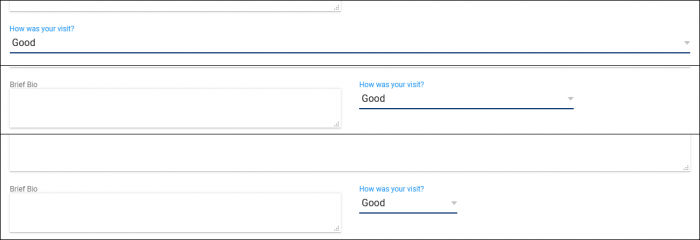
- This determines the size of the field. 100% will span the entire Info box, while 8% will only have enough space for a single letter to be visible. The example screenshot below displays our custom field at 100%, 33%, and 17%.
- Custom Fields are formatted automatically. For example, if you have a 50% width field followed by another 50% width field, they will appear on the same line at the same height in the page. If this box is checked, it forces this custom field to start on a new line regardless of the width of the previous field.
|


