|
|
Log Listing Customization
The Log Listing and Kiosk views of TracCloud can be easily customized, determining what data shows up and how it displays. Whether you only need a couple fields visible, or you need a lot of information but want to make sure one element is more prominently displayed than others, this article will explain exactly how to accomplish this.
These settings can be found in your Profile Preferences under the Log In/Out prefs. Your Kiosk and Visit Log List views can be customized separately, but the method for modifying them is the same.
File:H35h5j35h3g534f.png
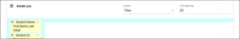
To begin, let’s start from scratch, with just one empty row visible. Left-clicking the row brings up a menu that lets us select what we want to add, from fields to additional rows.
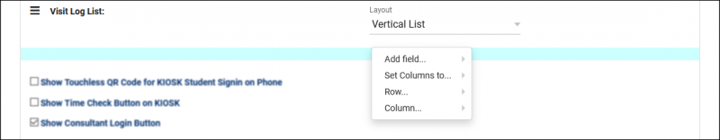
- This lets us add fields that are going to be visible from the log listing. The student’s name, their visit reason, the logout button, etc. If you aren't seeing the field you want to use in this list, choose Twig Text, then click on that newly added item to specify a custom Twig Tag. More information on Twig.
- This allows us to adjust the width of each column within this row. “1” will make a single column take up the entire row, while “6” allows us to add up to 6 fields per row.
- This is where we can add or remove rows. Having fields on separate rows allows you to adjust column width independently from other rows (as seen in the screenshot above). This is more frequently used in Tile configurations, since you won’t have as much horizontal space available.
- This lets us change the width of individual columns rather than relying on the row’s preset column width. We also have the ability to Split Column and Merge with next, which allows us to more specifically fine tune how large this field should appear in relation to other columns.
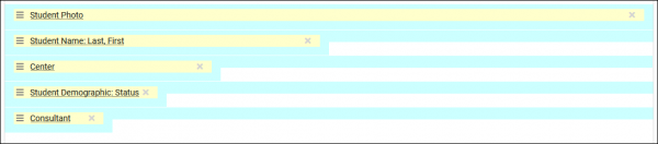
Each field can also be clicked on to display additional configuration options, such as font and label settings. Not every field will contain the same options, it depends on what is applicable to that particular field.
File:6j5m56b5467k.png
- What is the format for the [field]
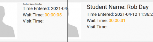
- Certain fields can be displayed in different ways. For example, a “Visit Time” field may contain the total time, the wait time, or the time entered. “Student Name” lets you choose different name formats, like “First Last” or “Last, First.” Depending on the information you want to display, this option will likely need to be changed.
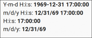
- What is the date/time format?
- Determines the time formatting for relevant fields.
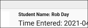
- Would you like to display the label?
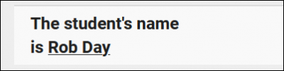
- Toggles whether or not a label is displayed. For example, in the screenshot in the next preference, you can see that the student’s name is following the phrase “Student Name,” this is the label, which can be hidden if preferred.
- Would you like to display the data in bold face?
- Displays the field in bold lettering.
- What font style would you like to display the text?
- Allows you to display this field in italics/oblique.
- Would you like to adjust the size?
- Allows you to adjust the text size of this field. The example below compares “X-small” to “XX-large.”
- What color would you like to display the text?
- Write out the color you would like this text to display as. Blank/default is black.
- Colors can be specified by typing “red,” “blue,” etc.
- Hex color values can be entered as: #0C3773
- The center color can be used by entering: {#Center Color#}
- What is the label override?
- Allows you to rename the field label if you don’t want to use the default name. For example, the Student Name field’s standard label is “Student Name,” but you can change this to something like “Client” or “Name” if you’d prefer.
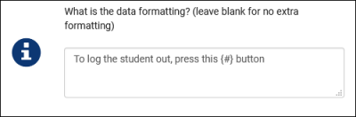
- What is the data formatting?
- Data formatting allows you to pull these fields into a specific portion of text. Similar to labels, but more flexible. This also provides the ability to apply HTML formatting to these fields as well, which is not possible with labels.
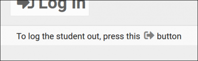
- Use {#} to determine where the field displays in your text. The example below is for the “Log Out the Student Button” field.
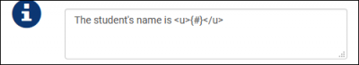
- Here’s an HTML example for the student’s name.
- Would you like to hide this field from being displayed?
- This setting hides the field from view. If you want to disable a field for the time being, but don’t want to completely remove it in case you need it again soon, you can hide it instead.
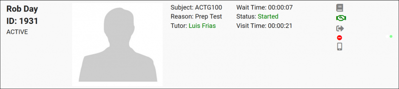
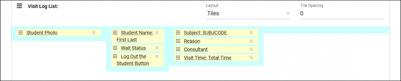
Using this information, we can start adding fields to put together our Log Listing. For example, maybe we want the student’s photo to be visible on the left side of the screen, then their name and visit time, followed by the visit details in the middle, then the visit controls on the right-side. That gets us a configuration like this:
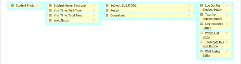
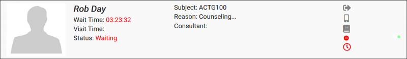
Which will cause our log listing to display as such. A couple field-specific changes were also made, such as the “Student Name” field being set to display in bold italics.
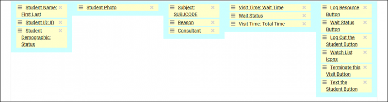
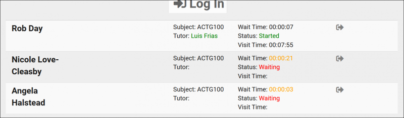
As another example, let’s say we want the student photo more centered, their personal information on the left, and their visit information on the right. Here’s what that configuration might look like:
Which displays as:
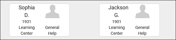
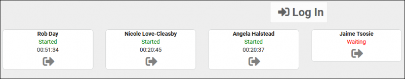
And one more quick example before we take a look at tiles, here’s a more minimalist log listing, only including a small amount of information in a more compact space.


Vertical List vs TilesAll of the examples shown so far have been using the default “Vertical List” layout, which displays each student on their own row on the log list.
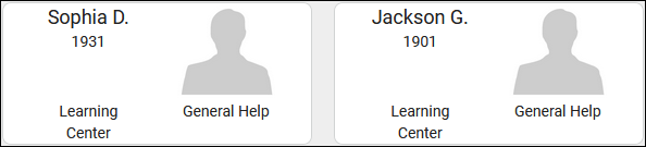
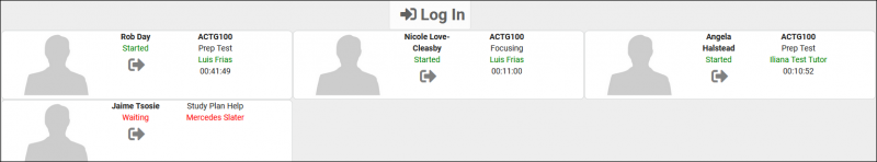
Alternatively, we can utilize the “Tiles” view. This will place the students side-by-side on the log listing. The tile spacing determines the size of the gap between tiles, playing a part in how many students can appear on each row.
Tile Spacing: 10
Tile Spacing: 50
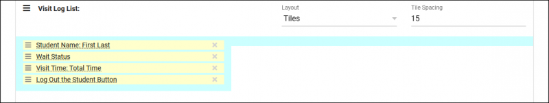
With this new format, we’ll want to reconfigure our Log List again to make sure it’s displaying as intended.
Here’s an example of a log listing with the same basic information as before, just in a more compact layout.
Alternately, we can have a super-compact view such as this.
This is by no means a complete list of possible configurations. This feature is extremely flexible and can be configured in a near endless number of ways. Hopefully reading through this chapter gave you a few ideas on how you can configure the log listing for your own system.
|


